
Souced image from wearesociety.co.
Imagine stepping into a Zara store. The walls are a chic, monochromatic grey, accented by sleek chrome clothing racks. The lighting is low, casting a spotlight on perfectly arranged displays of tailored garments. The whole ambience is sophisticated, almost like walking into a high-end art gallery. It feels undeniably cool, but maybe a touch too serious.
Then, just a few doors down, you enter a Chumbak store. It’s an explosion of color! Vibrant pinks, sunny yellows, and bold turquoise hues splash across the walls and furniture. Quirky patterns dance on cushions and throws. Upbeat music fills the air, and the whole atmosphere feels energetic and fun. It’s like stepping into a kaleidoscope compared to the serene minimalism of Zara.
Have you ever experienced this kind of shift in mood simply by walking from one store to another? It’s no coincidence. Colors are a powerful tool in retail branding, and stores use them strategically to create a specific experience for shoppers. Color-coded sections and clear signs can also make navigating the store a breeze, eliminating the frustration of getting lost in a maze of products.
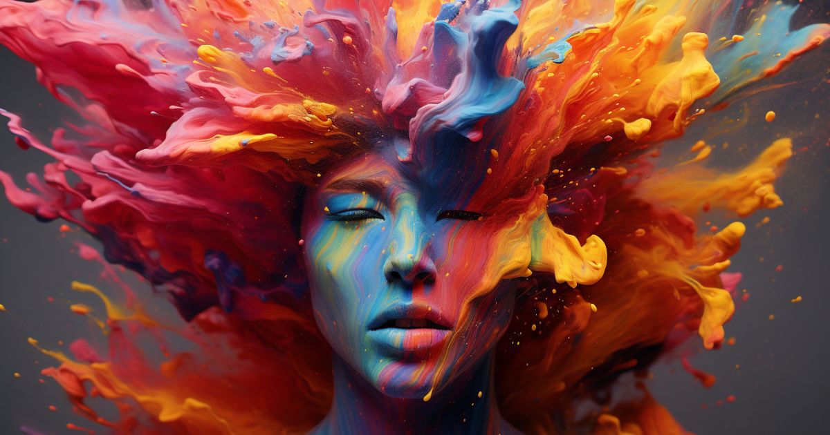
Entering a store may be an experience for all the senses. In addition to appealing scents and visual displays, colours have a big impact on the ambiance and how we behave while we shop. It’s not just a chance that you experience calmness in one store and energy in another; rather, it’s the outcome of a masterfully composed colour scheme intended to appeal to your subconscious. This article explores the intriguing field of retail colour psychology and explains how retailers utilise colour to connect with customers.
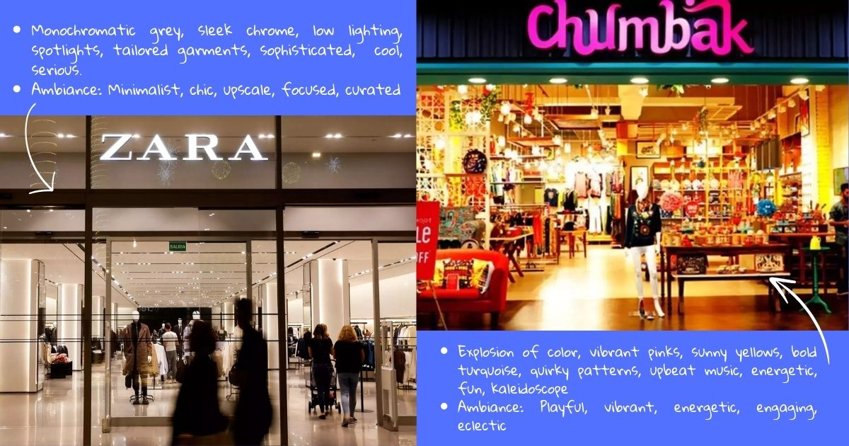
Graphic by Nandini Mane:Souced image from Zara and Chumbak stores.
The Power of Color in Branding
Research shows that color is one of the most important factors influencing our purchasing decisions. In fact, studies have found that:
- Up to 90% of a customer’s assessment of a product is based on color alone. (Source: CCICOLOR – Institute for Color Research)
- When choosing products, 84.7% of people consider color to be a major factor. (Source: Secretariat of the Seoul International Color Expo 2004)
- Color increases brand recognition by up to 80%. (Source: University of Loyola, Maryland study)
These statistics highlight the immense power that color wields in shaping our perceptions and influencing our behavior as consumers. By understanding the psychology of color, retailers can create a brand identity that resonates with their target audience and steers them towards making a purchase.
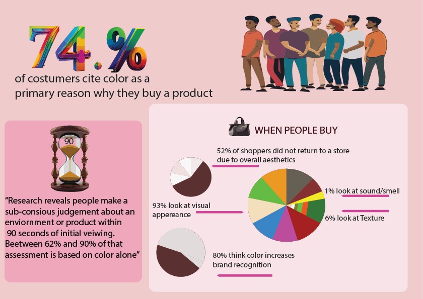
Information for the visual sourced by colorcom. Graphic by Ruchita Jeswani.
Colors Cast a Spell: The Power of Color Psychology in Retail Branding
As per article published by 99designs.com, Our feelings, perceptions, and actions are significantly influenced by colours. They can arouse emotions such as joy, trust, excitement, or relaxation, all of which have an impact on our buying experiences. Applying paint isn’t enough; you also need to carefully choose colours that complement your company identity and connect with your target market.
Imagine entering a clothes store with crisp white shelves and boring beige decor. It has an almost antiseptic, uninspired vibe. Imagine now entering a store that is a riot of sunny yellow and orange colours. You get a sudden rush of enthusiasm and energy. Retailers intentionally chose to create a welcoming and engaging environment, which explains this disparity.
Warm colours like red, orange, and yellow are frequently employed near the entrance to draw attention and elicit excitement, according to branding expert Falguni Sampat. Warmth, vigour, and optimism are conjured up by these hues, which provide the ideal atmosphere for a satisfying shopping trip. On the other hand, soothing colours like blues and greens are purposefully used in other sections of the store to encourage browsing and relaxing. Branding specialist Loveena Mehta stresses the value of clearly color-coded areas and signs since they make it easier for customers to navigate the store and improve their entire shopping experience.
Decoding the Rainbow: Understanding the Psychological Effects of Colors
Each color has its own unique language, evoking specific emotions, associations, and cultural meanings. Let’s take a closer look at some of the most commonly used colors in retail and their psychological effects:
– Violet: This regal hue, which is connected to monarchy and elegance, radiates richness, sophistication, and inventiveness. Violet is a colour that luxury brands use a lot to communicate exclusivity and sophistication. Imagine entering a jewellery store with opulent violet touches that would make you feel enticing and opulent while you perused their amazing selections.
According to colour-meanings.com, Indigo: Wisdom, intuition, and spiritual insight are represented by the deep, enigmatic, and introspective colour indigo. Using indigo into their branding is common for companies looking to convey a feeling of sincerity and depth. Imagine a bookstore that invites you to immerse yourself in the profound wisdom found inside its pages, with walls decorated in rich indigo tones.
– Blue: Calming, trustworthy, and dependable, blue is a popular choice for brands looking to instill a sense of security and reliability. Imagine walking into a bank or a healthcare provider’s office painted in soothing shades of blue. Instantly, you feel a sense of calm and reassurance, making you more likely to trust the brand and its services.
– Green: Symbolizing nature, growth, and harmony, green is often associated with health, wellness, and sustainability. Eco-friendly brands and those promoting organic or natural products often use green to convey their commitment to environmental responsibility and their connection to the natural world.
– Yellow: Bright, cheerful, and optimistic, yellow is like a ray of sunshine on a cloudy day. It evokes feelings of happiness, positivity, and energy, making it an excellent choice for brands looking to create a warm and inviting atmosphere. Imagine walking into a children’s clothing store bathed in vibrant shades of yellow. Instantly, you feel uplifted and eager to explore.
– Orange: This brilliant colour evokes enthusiasm and promotes social engagement. It radiates vitality, inventiveness, and warmth. Orange is a popular colour for branding by companies looking to create a lively and fun environment. Imagine a co-working facility that features orange accents to promote creativity and teamwork among its members.
– Red: Known for its ability to grab attention and stimulate the senses, red is often associated with excitement, passion, and urgency. It’s no wonder that retailers use red strategically to highlight sales, promotions, and clearance events, as it can trigger impulse purchases and create a sense of urgency in shoppers.
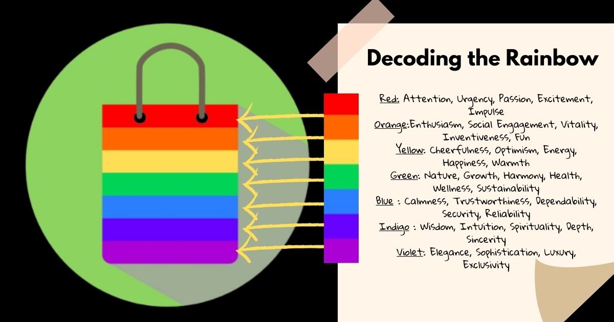
Graphic by Nandini Mane.
Cultural Nuances Matter: Understanding the Global Impact of Colors
Colours have psychological affects that are universal, yet cultural interpretations of them might differ greatly. In one culture, something that is considered upbeat and optimistic could be connected to grief or considered forbidden in another. For instance, in many Asian cultures, white is customarily worn at funerals, despite the fact that in Western societies it is frequently connected to purity and fresh starts. As a result, it’s critical for companies who operate in international markets to be aware of cultural sensitivities and modify their colour schemes accordingly.
Expert Insights: The Art and Science of Color in Branding
We sought the opinions of industry professionals in order to have further understanding of the realm of colour psychology in retail branding. Experienced branding expert Falguni Sampat underlined the need of comprehending how various hues elicit associations and feelings in customers. “By leveraging the psychological effects of colour, brands can create memorable experiences that resonate with their target audience,” she says.
Branding expert Loveena Mehta emphasised how colour shapes a brand’s identity and image. “The colours a brand chooses can have a significant impact on how customers perceive their products or services,” she explains. “It’s essential for brands to select colours that align with their brand values and evoke the desired emotional response in consumers.”
Another branding specialist, Priyanka Ashar, issued a warning about typical colour selection hazards. “Using too many colours or blindly following trends can dilute a brand’s identity and confuse consumers,” she cautions. “It’s important for brands to stay true to their core values and choose colours that reflect their unique identity.”
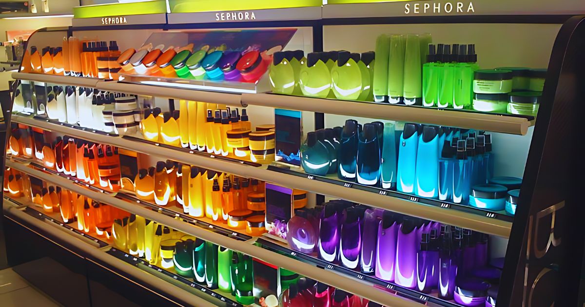
Sourced image from Sephora.
The Future of Color in Retail: Emerging Trends and Innovations
As per a youtube video by Picmaker,The function of colour in retail branding is ever-changing as consumer preferences and technological advancements both progress. Colour in retail is expected to change in the future due to new trends like personalisation, interactive experiences, and sustainability.
Imagine entering a store where the colours shift to suit your tastes or mood, or where the colourful displays are made using eco-friendly dyes. These developments show a brand’s dedication to environmental responsibility and innovation while also improving the shopping experience.
Conclusion: The Art of Colorful Communication
In conclusion, color is a powerful tool that goes beyond aesthetics in the realm of retail branding. It’s a strategic language that speaks volumes to our subconscious, influencing our emotions, guiding our shopping journeys, and ultimately shaping our purchasing decisions.
By understanding the psychology of color and its cultural nuances, brands can create immersive experiences that resonate with customers and leave a lasting impression. So the next time you find yourself enchanted by the colors of a store, remember – it’s not just a coincidence, it’s the secret language of color speaking to you.
FAQs
- Can color psychology help me make better shopping decisions?
Absolutely! Understanding how colors influence your emotions can help you be more mindful of impulse purchases and make conscious choices that align with your needs and budget.
- How can I use color psychology in my own life?
The principles of color psychology can be applied beyond retail. For example, consider painting your home office a shade that promotes focus and productivity (like blue or green), or choosing calming colors for your bedroom to create a relaxing environment.
- What are some online resources where I can learn more about color psychology?
There are many websites and blogs dedicated to color psychology. You can also find informative videos on platforms like YouTube that explore the link between color and human behavior.
- How do cultural differences impact color choices in branding?
As mentioned in the article, color associations can vary greatly depending on culture. Researching cultural preferences for specific colors can help brands avoid unintentional offense and ensure their branding resonates with a global audience.
- What role does lighting play in color perception?
Lighting can significantly impact how colors are perceived. For example, warm lighting can make colors appear more vibrant and inviting, while cool lighting can create a more subdued atmosphere. Retailers often use lighting design to enhance the impact of their color schemes and create the desired mood in their stores.